

Understanding env() Safe Area Insets in CSS: From Basics to React and Tailwind
In the realm of modern web development, creating responsive designs that adapt seamlessly across different devices is vital. A key aspect often overlooked is managing the safe areas on mobile devices, particularly those with notches or rounded corners. This is where the env() function and safe area insets in CSS come into play. Let's delve into this topic and explore its applications in CSS, React, and Tailwind.
What are env() Safe Area Insets?
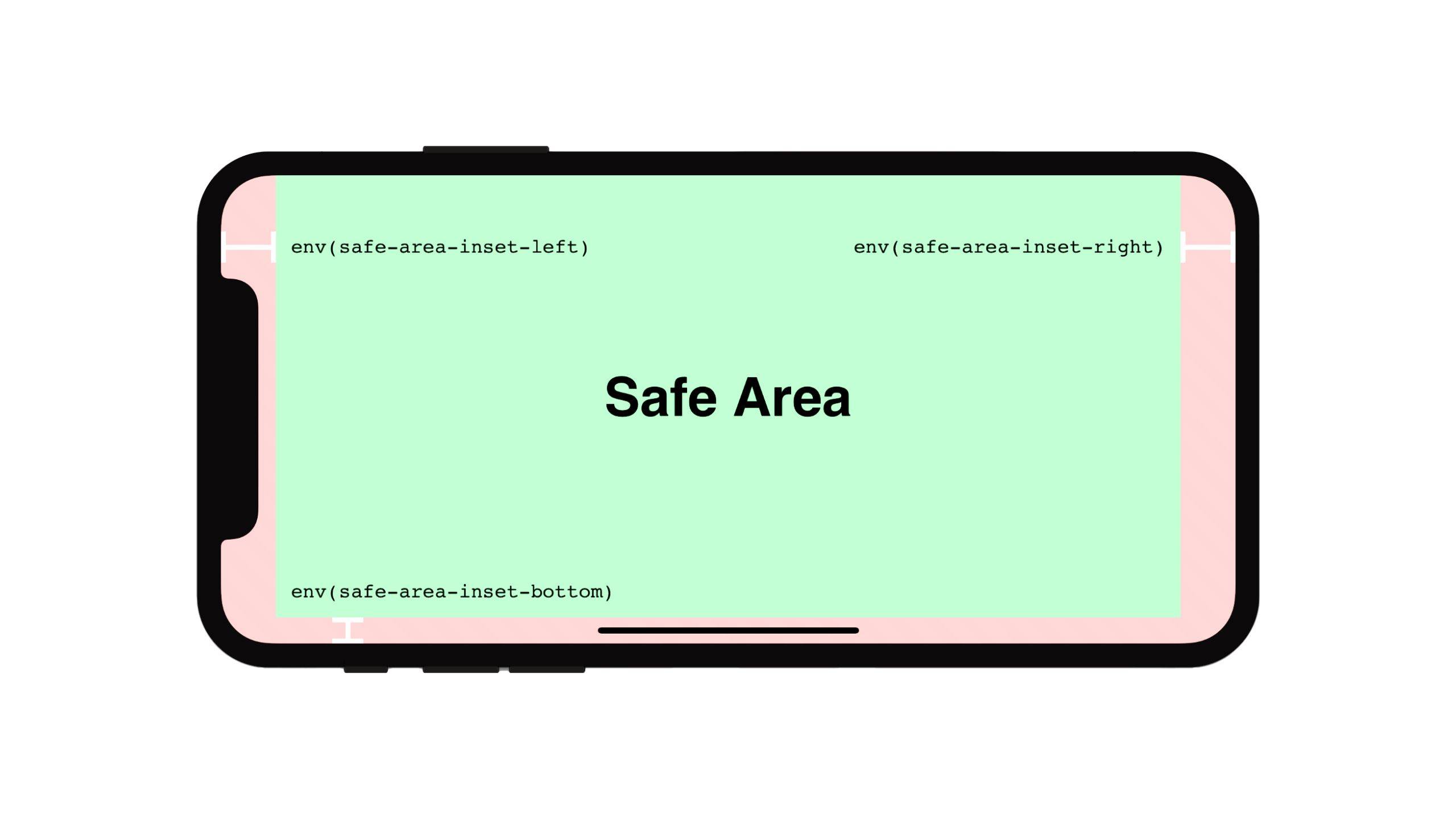
The env() function in CSS enables developers to access various environment variables, including safe area insets. These insets indicate the areas of the screen safe for content display, avoiding intrusion by system UI elements like the notch or home indicator on mobile devices.
Here are the four main safe area inset variables:
env(safe-area-inset-top)env(safe-area-inset-right)env(safe-area-inset-bottom)env(safe-area-inset-left)
Env Safe Area Inset CSS Example
Let's see a basic example of using these insets in CSS:
.content {
  padding-top: env(safe-area-inset-top);
  padding-right: env(safe-area-inset-right);
  padding-bottom: env(safe-area-inset-bottom);
  padding-left: env(safe-area-inset-left);
}
This code ensures that your content stays within the safe area on devices with notches or rounded corners.
Env Safe Area Inset JavaScript
You can also access these values in JavaScript using getComputedStyle():
const safeAreaTop = getComputedStyle(document.documentElement).getPropertyValue('--sat');
console.log(safeAreaTop);
First, define the CSS custom property:
:root {
  --sat: env(safe-area-inset-top);
}
Troubleshooting: env(safe-area-inset-top) Not Working
If env(safe-area-inset-top) isn't working, make sure you've added the viewport meta tag with viewport-fit=cover:
<meta name="viewport" content="width=device-width, initial-scale=1.0, viewport-fit=cover">This tag allows content to extend into the safe area, enabling the use of safe area insets.
Env Safe Area Inset in React
In React, you can apply safe area insets to components using inline styles or styled-components. Here's an example with inline styles:
function SafeAreaComponent() {
  return (
    <div style={{
      paddingTop: 'env(safe-area-inset-top)',
      paddingBottom: 'env(safe-area-inset-bottom)'
    }}>{/* Your content here */}</div>
  );
}
Handling Issues: safe-area-inset-bottom Not Working
If safe-area-inset-bottom isn't working, ensure that you've included the viewport meta tag mentioned earlier. Also, make sure your content extends to the bottom of the screen; you may need to set min-height: 100vh on a parent container.
Env(safe-area-inset-bottom) in Tailwind
For Tailwind CSS users, you can utilize safe area insets by extending your configuration in tailwind.config.js:
module.exports = {
  theme: {
    extend: {
      padding: {
        'safe': 'env(safe-area-inset-bottom)'
      }
    }
  }
}
You can then use it in your classes:
<div class="pb-safe">
  {/* Content with safe area bottom padding */}
</div>
Page Navigation and Safe Areas
When implementing page navigation, especially for mobile web apps, consider the safe areas to avoid interference with system UI. For instance:
.bottom-nav {
  position: fixed;
  bottom: 0;
  left: 0;
  right: 0;
  height: 60px;
  padding-bottom: env(safe-area-inset-bottom);
  background-color: #fff;
}
This ensures your navigation bar respects the safe area at the bottom of the screen.
Bottom Navigation Bar Example
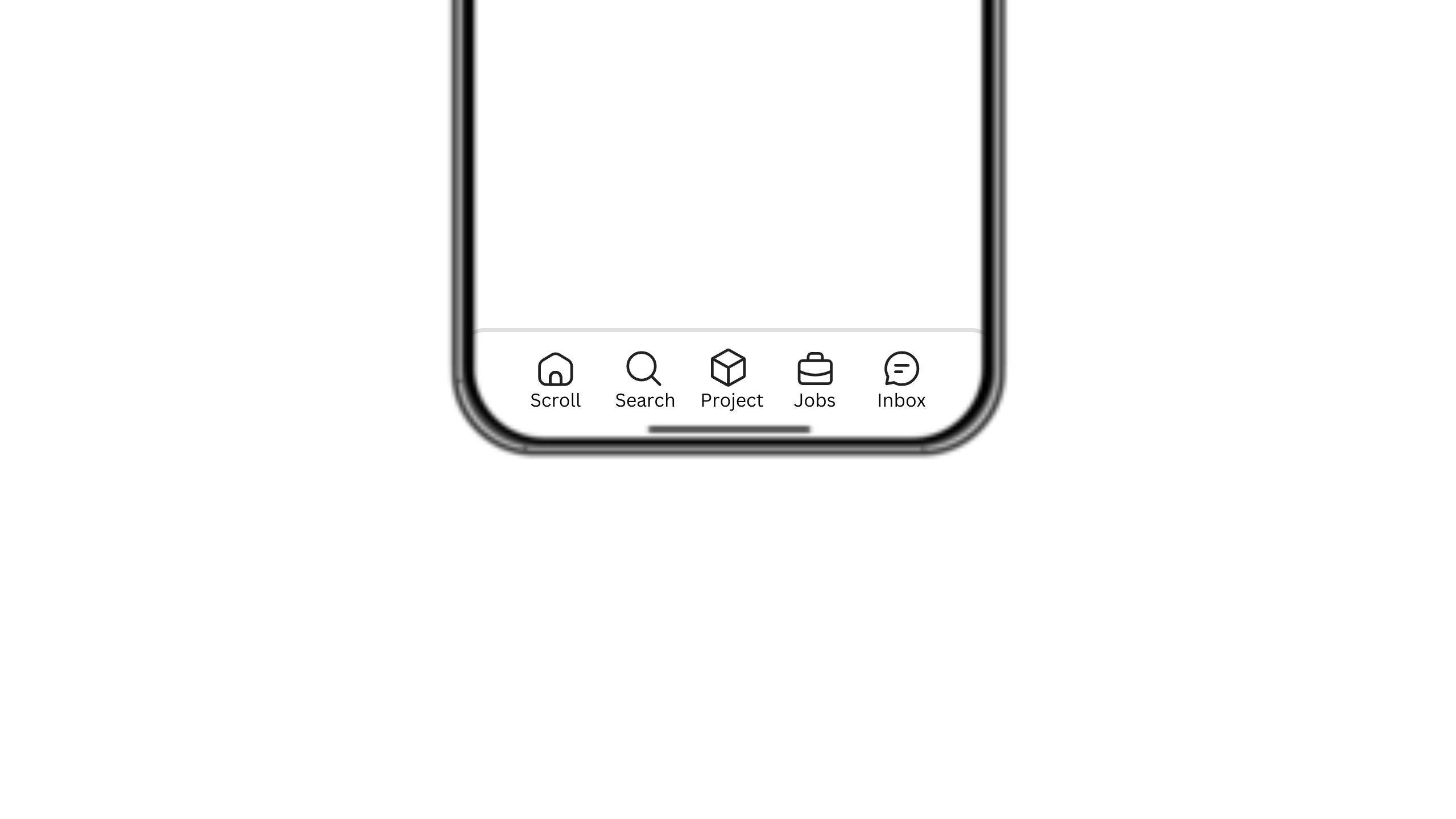 A common scenario in mobile web design is implementing a bottom navigation bar. On devices with home indicators or gesture bars, this can lead to overlap issues. Safe area insets can solve this problem.
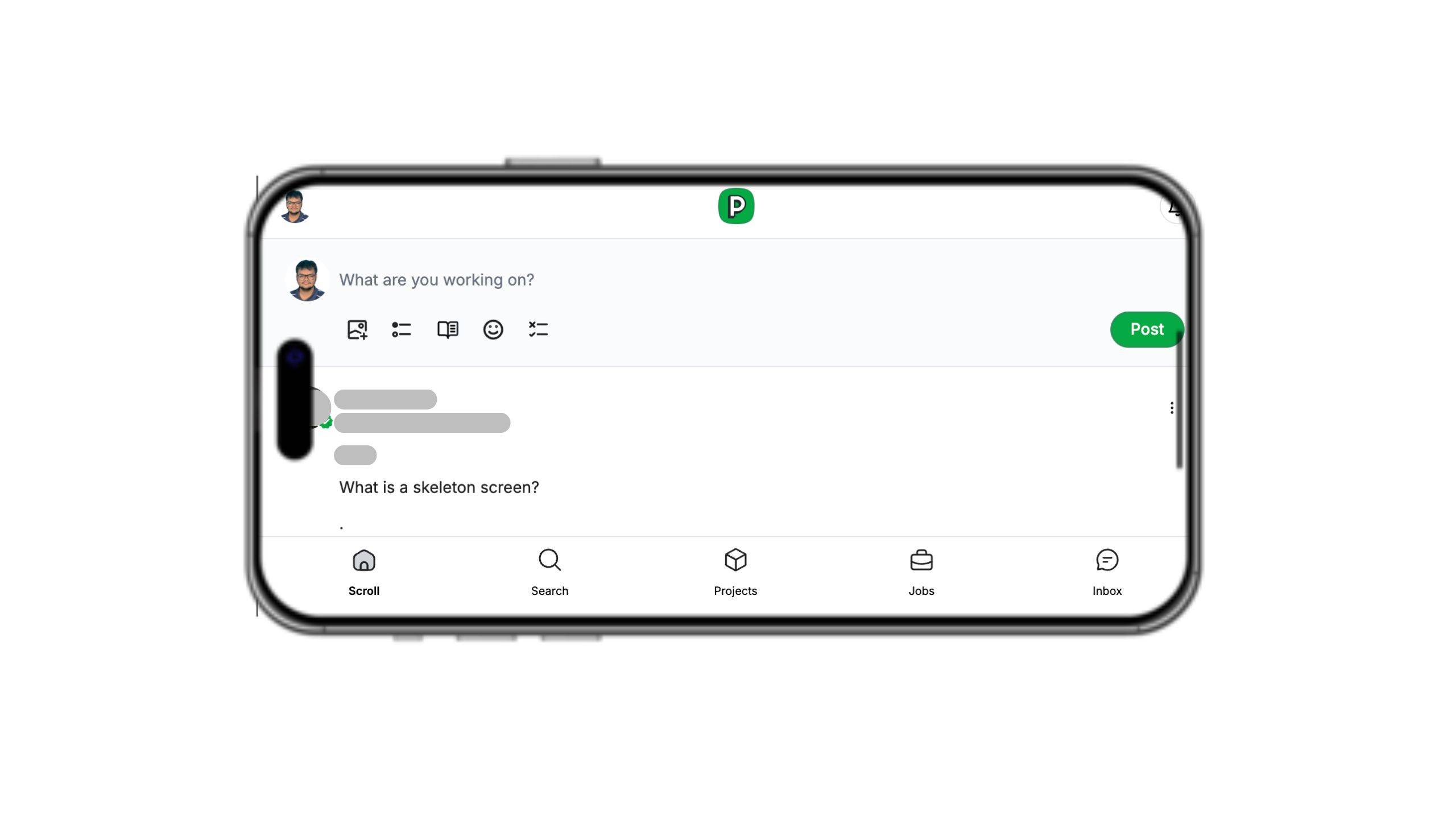
Problem:
.bottom-nav {
  position: fixed;
  bottom: 0;
  left: 0;
  right: 0;
  height: 60px;
  background-color: #fff;
}
On devices with home indicators, part of your navigation bar might be cut off or overlapped.
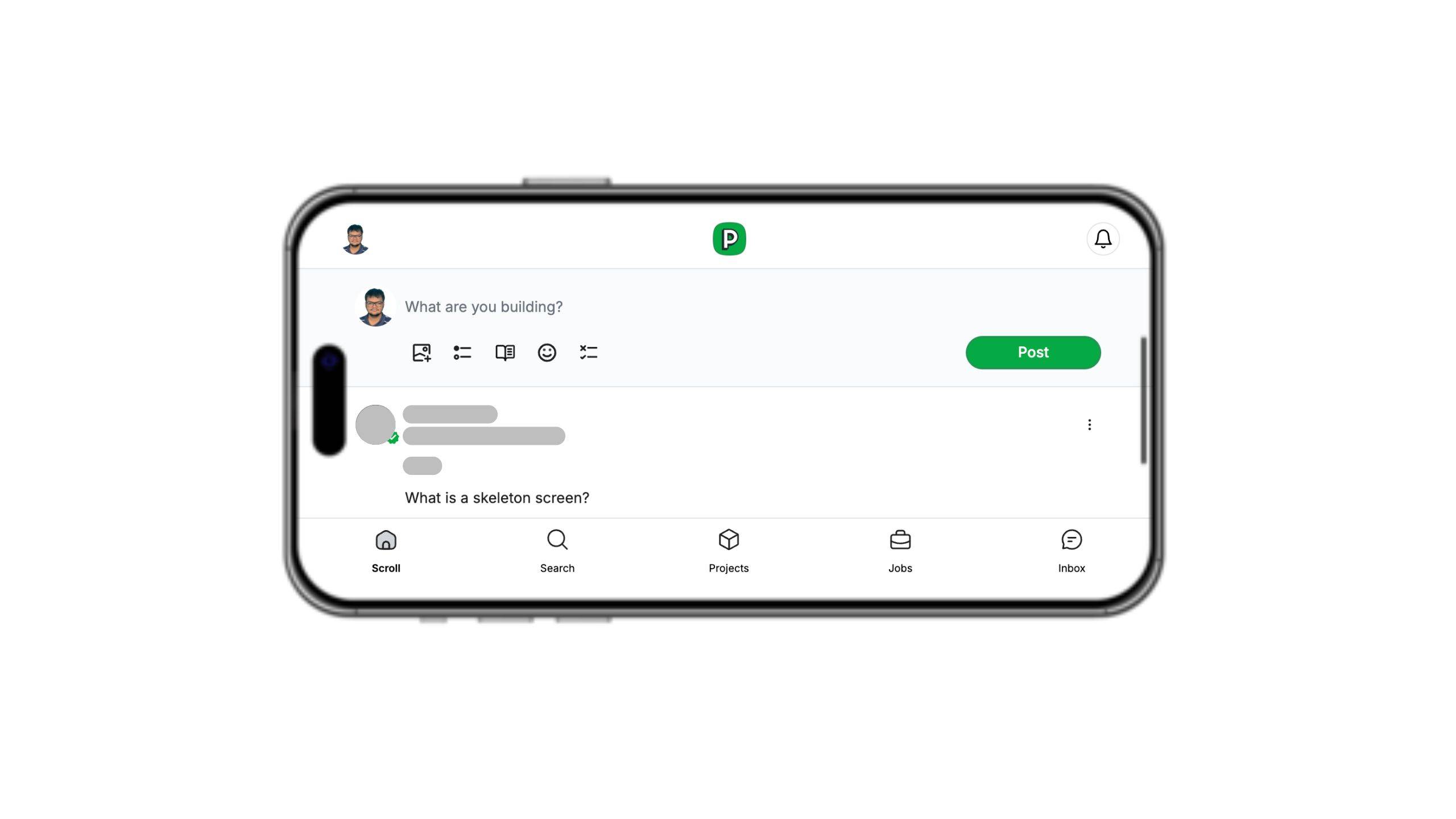
Solution:
.bottom-nav {
  position: fixed;
  bottom: 0;
  left: 0;
  right: 0;
  height: calc(60px + env(safe-area-inset-bottom));
  padding-bottom: env(safe-area-inset-bottom);
  background-color: #fff;
}
By adding padding-bottom: env(safe-area-inset-bottom) and adjusting the height, you ensure the navigation bar's content is fully visible and easily tappable, even on devices with home indicators or rounded corners.
Handling Safe Areas on Device Rotation
When devices are rotated, they often have more width and less height. This can cause content to be obscured by rounded corners or notches on the sides. For instance, the left and right edges may have some space cut off, affecting the visibility of elements.
To address this, you can use the env() safe area insets to ensure content stays visible and within the safe areas. This is particularly useful for elements positioned near the edges, such as navigation bars or side buttons.
Example CSS for handling rotation:
.rotated-content {
  padding-left: env(safe-area-inset-left);
  padding-right: env(safe-area-inset-right);
}
By applying padding-left: env(safe-area-inset-left); and padding-right: env(safe-area-inset-right);, you can ensure that your content remains within the safe area even when the device is rotated. This approach helps in maintaining a consistent and user-friendly design across all orientations.
PS: do follow me on peerlist
Conclusion
Understanding and implementing env() safe area insets is crucial for creating polished, responsive designs that work well across various devices. Whether you're using plain CSS, React, or Tailwind, incorporating these insets improves the user experience, especially on modern mobile devices.
Remember to test your implementations on different devices and browsers to ensure consistent behavior. Happy coding!