Taming Overflowing Text: The Power of the CSS hyphens Property
When reading a book or jotting down notes, you've probably seen words broken up with hyphens at the end of a line. This happens when there's not enough space for the whole word, so it gets split to continue on the next line. This technique helps make the text fit neatly within the margins.
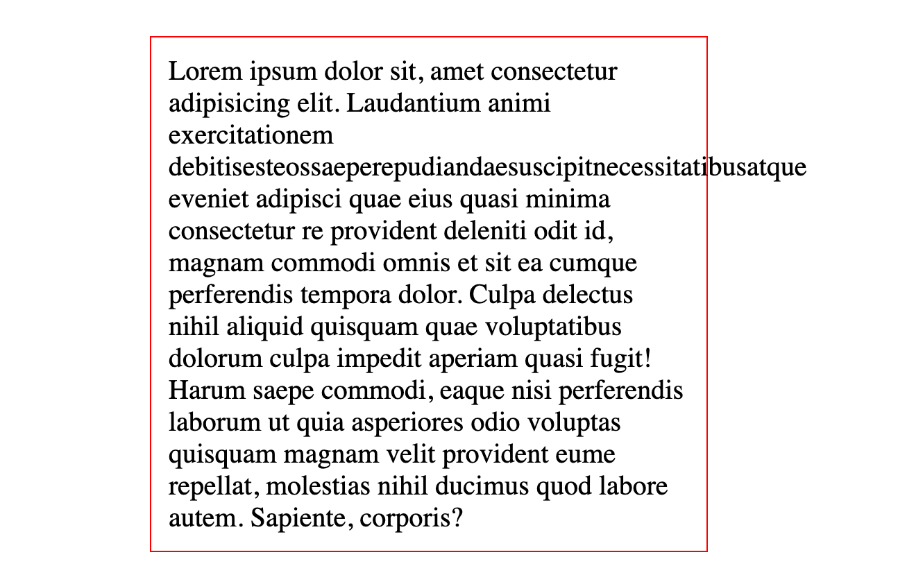
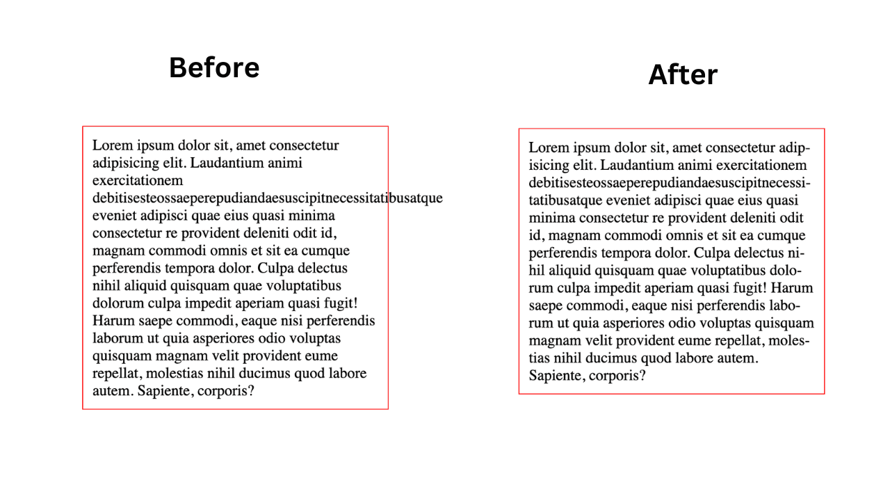
But what if you encounter a similar issue on a website? Imagine a scenario where you have a block of content inside a red-bordered box, and the text is overflowing beyond the box's boundaries. This overflow often happens with long words that can't fit within the designated space.

The Magic of hyphens: auto
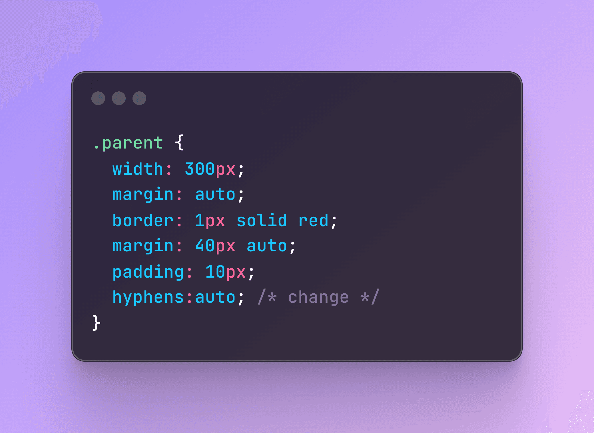
By using the hyphens: auto CSS property, you can instruct the browser to automatically insert hyphens at appropriate points within the word, allowing it to break across lines without overflowing the content outside its container. This approach can be incredibly useful for responsive web design, where text needs to adapt seamlessly to different screen sizes.
.your-container-class {
  hyphens: auto;
}
A Minor Trade-off
While hyphens: auto is a great solution, it's not without its quirks. The browser might sometimes add a hyphen to words that could fit perfectly on the next line without a hyphen. It does this to maintain consistent text flow and prevent any possible overflow.
This behavior might not always be ideal, but it's a small price to pay for ensuring that your content stays within the boundaries of its container, especially when dealing with dynamic content or responsive layouts.

Conclusion
The hyphens: auto property is a nifty little trick for managing text overflow in web design. With just one line of CSS, you can improve the readability and layout of your content, especially on smaller screens or when dealing with dynamically changing content.
So, next time you see content spilling out of its box or container, remember that a simple CSS tweak could be all you need to keep things looking neat and tidy.

